Wednesday 5 December 2012

Functions of music videos

This post will cover why music videos are a thing. I -had- started a slideshow on this, but my computer which has PowerPoint on it isn't being too friendly, which is an incredibly convenient excuse for me to communicate this information in a practical manner which allows me to clearly lay out my work in a way that lets the reader easily refer back to previous parts, as opposed to an impractical "look mum, I can use interactive media!" manner. But I digress.

So, what is the purpose of music videos?

In short, to acquire this:


This is the incentive behind music video production in general: for major institutions to acquire lots and lots of money from people who have far less money than they do.

This can be broken further:


  • To promote the individual product - producing a video for a song means you have a chance to get your song featured on one of the few remaining music programmes on television, and to get your video a positive presence on video sharing websites such as YouTube (yes, I know someone's likely to upload it anyway, but your song is more likely to be taken seriously if you have a professionally produced video than if you have a terrible Windows Movie Maker lyrics video uploaded by some illiterate kid who attributes the song to the wrong artist... -_-). 
  • To promote the artist's star image - as per Dyer's theory, the record institution can develop a 'star image' for the artist, which essentially functions as the artist's brand. This can be done by implementing some of the conventions Goodwin mentioned, such as lots of close-up shots of the artist, and recurring motifs between videos. 
  • To monetise directly from the video (YouTube) - if the label sets up a YouTube account on behalf of the artist, they can partner the account, upload some entertaining music videos people will want to watch multiple times, and generate revenue from the advertisements on that page (which is amplified if the video receives a lot of hits). (At over 880,000,000 hits right now, I would take a guess and say that PSY's Gangnam Style video is pulling in some money...).
  • To mask the bland nature of the music - this allows the institution to get away with publishing boring tripe that no-one would care for otherwise. It doesn't matter that the track consists of a recycled electronic stock beat, a mediocre synth loop which isn't anything special and auto tuned vocals which makes the vocalist sound like every other performer in the charts at the moment; this will sell because the music video gives us some memorable imagery, which people will remember over all the other music out there which doesn't have this kind of imagery. 
  • To create entertaining content - this on its own is more common among lesser-known independent artists who haven't been swallowed by major institutions and milked for everything they're worth. 
-HM.

Thursday 29 November 2012

Production Update 2 - File Management


So yes, I have imported the clips from Thursday's performance recording session into Final Cut, and have separated them into bins based on the kinds of shots.

This may not be a conventional organisation manner, but I have my reasons - right now I am focusing solely on the performance section, and will worry about narrative later. Because of the untamed nature of my character's mentality, I want to borrow parts from as many takes as I can, to give a disjointed tone to the video. Provided they can all be chroma keyed properly, I hope to use something from each of the clips (excluding the PRODUCTIVITY files; those are ones from the green screen test montage which I imported by accident. Failure.).

-HM.

Friday 23 November 2012

Production Update 1 - It begins...

Yesterday, as mentioned in the planning post, I started filming the performance section of the video, with assistance from Mr. N..

In terms of equipment, I decided we should approach this with a multi-camera setup; this is because I want to have multiple different angles and using multiple cameras for this is less time consuming than having to shoot each part over and over for each angle. I would usually point out that this also helps out with avoiding continuity errors, but in this case I'm actually going out of my way to avoid perfect continuity from shot to shot to represent the broken manner in which the performer sees himself (the whole light vs. dark thing).

The cameras we've used are my Bloggie which Mr. S. issued me at the start of last year that I've sort of... kept, and three more Bloggies which I borrowed from the Media Studies department.


To keep the cameras in place we used the tripods from the store room; each one of these attaches to the camera in a slightly different way which is wonderfully inconvenient... but oh well. They did what they needed to do.

I also borrowed Sir's laptop - this was used to play the song which I could use as reference when miming. A slight problem I've noticed is that in some parts I am slightly late starting; though this can easily be fixed with the "left a bit, right a bit" method in FCP.

Unfortunately as the backup of the footage is on the school computer I'm not able to put together one of those fancy raws montages like I did with the Sheena is a T-shirt Salesman raws; but I do have my Bloggie with me so enjoy these screenshots of me looking like a complete plonker.


-HM.

Thursday 22 November 2012

Initial Performance Filming Planning

This post is to keep informed regarding when I'm going to go about filming this thing.

The main framework of the video revolves around the performance sections; so these are the parts I will go about filming first. I can then go about filming the narrative sections to the appropriate lengths to 'fill in' the rest of the video.

I intend to film the performance parts in front of the green screen after school (after 16:00) today. These will be the first attempts, so I may need to refilm at a later date. Needs doing:

- Intro
- Opening verse (until "here we go buddy")
- "Do it"
- Chorus
- Verse (until "here we go buddy", again)
- "Do it"
- Chorus
- "Do it"
- Chorus
- ANGSTY ending

Whilst these are the parts which most notably need doing as per my original plan, I intend to record multiple takes of the entire song - this is so that a) it will be easier to sync up the video to audio as the takes will be about the same length as the song and b) so I have room for a bit of creative license should I decide to splice parts of performance into the narrative if the narrative doesn't seem interesting enough further down the line. I probably won't need to, but I want to keep my options open.

-HM.

Wednesday 21 November 2012

Rock Video Analysis 4 - I Am the Least of Your Problems

So I intend to use a lot of dark shots during the performance segments of my video (which in my case will be done using the green screen and a dark background), so I thought it'd be a good idea to see how other artists have approached this idea.

To make up for the worrying lack of FotL in our lessons since Mr. S. left, I'll have a look at the I Am the Least of Your Problems video, as it features a lot of performance sections in a dark area.

(heads up: lots of flashing lights)

This video shows the performers in a very dark room with the only solid lighting being on the band members themselves; this is creating a really sweet intense aura which in all honesty I think is very effective in setting a dark tone. I do intend to try to create a similar tone to this in the I Am... All of Me video, though I want to use the green screen to create an artificial setting as opposed to using an actual room for the sake of exploring the uncertainty of the performer's mental state. It also gives me the chance to play around with the background to move from dark to light to enforce the conflict idea I have mentioned in previous posts.

In terms of the kinds of shots used, I feel it is useful to look at the way Falco is presented in this video as he is playing guitar and lip-syncing, as I will be. A great deal of the shots of him are close ups of his face, with only the occasional mid shot to establish that he is playing a guitar; this is something I wish to use in my video as it will help establish my performer's image (as per Goodwin's theory) by making my face recognisable (thus boosting my ego making me famous and my record label lots of money as a result of it). The occasional mid shot is necessary to show the guitar; thus satisfying one of the conventions of rock videos.

Additionally: the blinding lights. I should use these! But not in such a blinding way. My song is much slower than this song, so I do not need to have them going so fast, and ideally I'd like to have an element of randomness as to when they go off (I will use the lights to represent the 'light' side trying to break through the darkness; I want it to be a struggle so it shouldn't use any kind of consistency). This will have to be done in post production rather than through the use of actual strobe lights to avoid interfering with the chroma keyer effect.

I also want to use some of the slightly random looking cuts we see here. Again, to emphasise the struggle of light vs. the darkness, I was thinking of having very short cuts to zoomed in versions of the shot which will be lighter than the main shot - I could also potentially have the main shot in greyscale with the short 'struggle' shot showing my face in colour. I'll see what looks best when editing.

-HM.

Album Image Analysis: The 2nd Law - Muse

For the sake of developing my own digipak for my artist, it is necessary to look at the presentation for albums which will appeal to a similar target audience to my product.

The album I'm going to be marketing is a rock album, so I should look at the presentation of other rock albums. One band which have a similar audience to the audience I identified previously (older teens/young adults) are Muse, so I will look at the way their recent album "The 2nd Law" has been presented.


Here we have the front cover. The main thing that stands out to us is how dark the tone of the front cover is. Whilst there is a lot of colour used, it is done in a way which compliments this dark tone, as opposed to making it look bright and friendly. There is a lot of emphasis on the abstract imagery on this cover, which gives the impression of it being dark and mysterious; thus intriguing those of the older teen/young adult demographic.

The band logo is placed in the top left corner of the cover; this is done in a way that it stands out (thus attracting long-term fans of the band) without overshadowing the original artwork in the centre.

The album title ("The 2nd Law") has a white to red gradient pattern acting as its colouring; this seems to be for the sake of adding a touch of colour to the text for the sake of making it more aesthetically pleasing. 

Track listing on the back! Here we see the same white to red gradient which we saw on the album title on the front, which seems to be for the sake of staying consistent throughout the presentation. This strengthens the album's image, thus making it more memorable to potential consumers.

On this same point of consistency, the back cover maintains the dark tone from the front cover; this reinforces the maturity of the album, which will draw in the target audience mentioned earlier.

-HM.

Sunday 11 November 2012

Digipak Analysis: Circle Of The Oath - Axel Rudi Pell

Digipak Analysis: Band On The Run (2010) - Wings

Digipak Analysis: One - Pearl Handled Revolver

Media Regulation Theories - Byron Review Notes

(Attn: posts under the "media regulation" tag is of relevance to the Media Regulation question in the exam paper, as opposed to coursework research).

The Byron Review

The review (conducted by Dr. Tanya Byron) looked at the potential effects of modern technology such as videogames and the internet on children. It provides a fairly balanced look at how children make use of technology and the various conceptions around it.

One of the points made in the Byron review is that there is a division in how people of different age groups understand what is presented in the media, with many parents not understanding what is being presented and thus having an irrational fear of it.

Byron highlighted that whilst some media content can be beneficial to the learning and development of children, other content can be inappropriate.

The review suggests that parents should help their children make decisions when online - whilst children typically have a great understanding of how the web works from a technical standpoint, their critical analysis skills can be lacking which can lead to them making bad decisions - which can threaten their safety.

The Byron review does in part look specifically at videogames, where it found that whilst there are a lot of systems in place which attempt to inform parents as to the content featured in videogames, however systems such as PEGI's age ratings do not always work as many parents mistake them as being difficulty ratings (because a 3 year old is OBVIOUSLY going to have an easy time with Mega Man...).


Friday 9 November 2012

Green Screen Experimentation

So, I plan on using the green screen for the performance element of my I Am... All of Me video. This is because I intend to make use a background which using some creative lighting effects to represent the confusing of the character as they try to choose whether to take the pathway towards being a brave-hearted hero or the pathway towards black-hearted evil.

Before I can start planning which shots I should use for the storyboarding phase of production, I need to know what is technically possible with the green screen in school. Because of this I thought it'd be a good idea to film some test shots from different angles to see what works well post-editing. There possibly are some obstacles I'll face as the green screen in school is very small - however this is a challenge one must face when they don't own a film studio.

Therefore, here is nearly two minutes of me acting like an idiot in front of said green screen (with backgrounds I happen to have saved on my computer - don't ask):


Many thanks to Mr. N. for sticking around after school to act as cameraman!

What worked well here then?

Static shots (where the camera stays in the same place) seem to work fairly well, though there are still some green reflections over my body. I'm guessing this is down to the lighting in the room at the time, but I may have to experiment more to pin down the exact cause.

As for what is in the shot itself, the first three shots show that I can get away with -some- movement myself, with only minor chroma keyer glitches showing through (usually near my hair and fingers). I did have problems with shots where I moved a lot though - there was one shot we attempted which featured me walking from outside of the shot straight past the camera, however this ended up being completely unusable when I tried editing it in iMovie. Because of this it will be necessary to keep the movement limited during the performance scenes.

Shots where the camera moves are a different story though; as we can see in the shot at 0:40 where Sir tried rotating the camera, the chroma keyer software struggles to keep up with it (resulting in some unwanted background and some moments where it clips through my jacket), which seems to be down to the way the visible lighting appears to change as the camera moves. This is also apparent in a later shot where Sir tries to pan the camera past me.

The very close up shot doesn't work on the basis that the software struggles to cope with the extra detail of my hair against the background, which makes the cut look like a bad magic wand job.


Because of this I should avoid using unnecessary very/extreme close ups during the green screen parts of my video - some will be necessary (Goodwin's conventions; plugging star image etc.) but I don't want to overkill it because I'd hate for my artist to be associated with terrible visual effects. I also still need to sort my eyes out, as we can see in the screenshot above.

Getting the chroma key to work in iMovie was a tad fiddly; most of the shots didn't want to work off the bat, so I had to reduce the Green Gain in the Inspector until it looked right. There was no formula for each shot, I just had to tinker until they worked. This could be annoying.

-HM.

Monday 5 November 2012

Rock(?) Video Analysis 3 - Bring Me To Life (and production notes)

Let me tell you folks a story. Last year I had a fantastic Media Studies teacher. He did awesome things like pretending to be Falco and picking fights with chairs. He's also probably reading this and sitting there with a grin right about now.

Unfortunately this year I no longer have the privilege of being taught by the king of the hipsters himself, though I did start warming to the new teacher. He seemed like a nice guy at first. He'd write entertaining and productive comments on our blogs. He'd let us into the Mac room when we needed it. Generally seemed like the kind of person you'd want to be working with.

But that all changed when he made me listen to this:


 This is Bring Me To Life by Evanescence. But you knew that, because you can read.

I guess the reason why Sir suggested I take a look at this video is because it has a narrative focus on it, much like the plans I have for my own video. Makes sense. Though I'm sure there are plenty of other videos I -could- look at, and he just wanted to annoy me...

On to the video itself - what do we have? I'm going to focus a fair bit on the intro and then analyse the unique 'set pieces' further on. I'm not going to be looking as far into Goodwin's theory here as I'm aiming more on picking out how the narrative and performance sections are used


This is just an establishing shot, giving us an idea of whereabouts the video is set in CGI-land. This is actually something I really need to think about in terms of my video's narrative section - my video isn't going to be anywhere near as abstract as this is so I don't need to spend as long introducing the different locations featured, though I should still use brief establishing shots as to avoid confusing the viewer. These will not need to be anywhere as long as the introduction to this video is - in Bring Me To Life this shot lasts for over 25 seconds; in my video they will only need to last for about 1 second (if not less) as I plan on filming in much less complicated environments. Additionally, by having faster establishing shots, my video will be adapting to the pacing of the song (which is significantly faster than this piece of [word of choice goes here]), thus satisfying one of Goodwin's conventions in the way that the visuals will be related to the music.


This is where my biggest gripe with this video comes in - here we see the lead singer in bed in a way that suggests we should be seeing some kind of story introduced to us, or at least a conceptual idea... but I have absolutely no idea what is going on here...

Now I'm starting to see why this is particularly useful to look at: I don't want to fall into the same pitfalls as these guys have. If your audience haven't got a clue what is going on in your video, you're failing to engage them - and in this day and age where there is a heavy division in a consumer's attention as it is - there's a great chance they'll just switch to a different tab meaning your opportunity to plug the artist's star image disappears, or worse still just turn it off altogether and stick something else on.

I need to make sure that when I produce my video, it is clear to the audience from the start as to what they are looking at during each individual shot.


Now she's falling free in the wind, in the wind! from the tower block because _______? If we go by Goodwin's I would take a guess and say that it's a link between the music and visuals in that they are using depressing imagery to accompany the depressing music, but it wouldn't really make much sense for the institution to go out of their way to say "look how depressing our track is" (even though it is). Unless, of course, they're trying to market to the 14-year-old "my life is terrible and I hate my parents so I'm going to rebel by only dressing in black" crowd. Which honestly wouldn't surprise me.

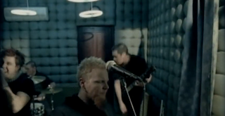
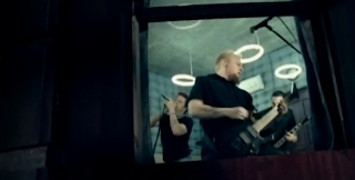

Here we have the other members of the band performing during the chorus. This actually makes some sense, so well done for getting something right guys! Why does it make sense, you ask? Because you're plugging the artist's star image with the most memorable part of the song, so anyone who's watched the video will mentally see the image of the band performing when they hear that part of the song (or have it stuck in their head). This reinforces the image. The next time the image comes around (i.e. when the band have a new record out) they remember the image and associate it with the chorus of this song, and if they somehow like this they will feel encouraged to buy the new song.


Now she's walking along the side of the building, scaring the living daylights out of their insurance company. Again, it doesn't seem clear as to why this is happening.


Ack, clowns! KILL THEM WITH FIRE.


So, she was climbing up to where the other band members are? This took waaaaaay too long to make itself apparent. If I wasn't watching this for a writeup I would have switched it off by now, so this narrative would have been completely wasted on me.


Band member tries to stop her from falling, she falls anyway. Well, actually, it looks more like he throws her. I would put this down to him being sick of her annoying, monotonous shrieking throughout the whole song. I can't blame him in the slightest actually.


AND IT WAS JUST A DREAM. I think. I actually feel kinda cheated that I sat through the whole thing for it to go absolutely nowhere. Overall, a horrifically bad video. I can now look at my issues with this video to avoid making mine as terrible.

So Sir, I did it. I'm sure I'll be able to find something awful for you to have to sit through and write about; how bad the chosen video actually is depends on how nice you are to us in lesson tomorrow!

-HM.

Sunday 4 November 2012

Early Production Outline


In PowerPoint because Sir said no essays. This was a difficult decision to make, because to me choosing which interactive media format to present my work in is like choosing which food product I'd rather die choking on. But eh.


Friday 26 October 2012

Sales Pitch Video


After giving up on several days' worth of work in FCP on the computer in school, I threw this together in iMovie in under an hour. Eh.

Part of my hair is out of place in this video and it frustrates me. Also the lack of alternate angles towards the end is down to the fact that I left Mr. N. in charge of preparing the additional cameras, and he was unaware of the fact that cameras need to have their batteries charged in order to work. Oh well. You can still hear what is being said as I ripped the audio straight from the close shot and borrowed it from the camera near the dragons as and when necessary.

This video covers things like my proposed artist name, why I've chosen the song and what I intend to include in the final music video. This is being posted in this format because interactive media content is supposedly better than text posts.

-HM.

Wednesday 24 October 2012

HOW DO I SENOUE?

What happens when one of the most incompetent guitarists ever tries to play a song by a fantastic guitarist?


This happens. This is me trying to learn how to play one of the parts of the song which will be performance in the video. For the sake of the production I need to learn how to play it to a standard which will allow me to mime the song convincingly; I filmed the many, many attempts in this video to try and get used to moving my hand to the right places on the guitar for it to look right if the song were to be dubbed over. This is going to take a LOT of work; as you can see I'm still pretty slow in terms of calling where I need to move to whereas the song itself is of a high tempo.

Ignore the hideous sound quality - it comes from a combination of my hilarious lack of skill, a cheap amplifier, and the fact I was recording with the Bloggie.

Eh. I do start screwing around at the end. If you need a good laugh at my expense, watch this video.

-HM.

EDIT: By the way I am aware I'm playing in standard tuning whilst the original song is in C. This won't matter when I'm miming.

Tuesday 23 October 2012

Sales Pitch Update

I did a mock sales pitch for my I Am... All of Me video concept last week. We filmed it. I have attempted to edit it.

I have failed to edit it.

Reason? It is very time consuming, and children are a thing. To be more specific, I need a lot of time with the Mac to edit it together (as we had a multiple camera setup and FCP likes to take hours to render things) and there seems to be a lot of timetabled lessons in there when I have free periods.

Because of this, it's unlikely it will be finished in time for the start of half term, which is INCREDIBLY ANNOYING. I do hope to be able to get in there for 10 minutes one day this week so I can retrieve the raws so I can hopefully bodge-job something together in iMovie at home over half term so I am able to show the things which were discussed on the blog.

I'm starting to think I need a "catastrophic failure" tag on here.

Saturday 20 October 2012

Why are jewel cases still a thing?

This is a slight digression from the other R&P posts on here but it relates to the way that music is distributed and I know we have to design a digipak to sell the CD for the final coursework artist even though I'm the only person in the world who still buys CDs...

Why do some publishers feel the need to sell their discs in plastic jewel cases, even though better options are now available?

The photos I'm using are for the sake of examples of how publishers have chosen to distribute their products rather than to comment on the artists featured.

First problem with jewel cases: this can happen.


Plastic can get scratched or cracked really, really easily. And when it does, it looks awful. See those two lines in the bottom right? They're there for good now, which is a major frustration for anyone who is fussed about the presentation of their music library (yes, my CD drawer is organised first by alphabetical order and secondly by year of release of the original copy).

Another issue is the general effort put into the presentation. Jewel case presentation is pretty much limited to the front cover artwork and the track list page on the back, whereas digipak presentation seems to be much more detailed. Let's have a look at a comparison -


The digipak looks so much tidier here - the way the inside artwork has been carefully cropped to fit the shape of the box, the way the booklet has its own little slot cut to shape, the way the disc is hidden away to improve the art's presentation whilst still being easily accessible etc.. It just looks so much more appealing than the typical "book goes here, disc goes here" situation we get with jewel cases.

There is the argument that it would cost more to produce more unique artwork for the insides of a digipak, though personally I believe it would still be more appealing than a jewel case even if they use basic cheaply produced graphics like simple snapshots of the band etc..

In my eyes record labels do need to realise that they need to put some effort in to persuade people that they're getting a better product in the long run if they own a physical copy of an album as opposed to just pirating it; and as someone with mild collection tendencies I feel more 'proud' to own albums which have had great care put into their presentation on top of their musical value.

Another point is the long time wear. Any CD case you own is likely to get a bit worn after a while; that's nature. It's just that from my experience digipaks seem to age more respectfully than jewel cases. Whilst card digipaks do get a bit dog-eared in the corners and some of the colour can fade, they don't end up being anywhere near as bad as scratch and fingerprint smothered jewel cases (all of which occur from typical everyday use).

Some albums try to counter this by having the jewel case inside a card cover -


- though this doesn't work. Why? Because the card gets tired out instead, due to the thin edges.


This is probably more of a random ramble than anything productive (yay for writing inspiration at half-past two in the morning!) but I think it's definitely necessary to look at the pros of the digipak format.

-HM.

Tuesday 16 October 2012

Porcelain Recreation Evaluation - Oh dear...

So I exported the final version of the Porcelain recreation today. It is terrible.

First thing I'm going to note: yes, this post is overly self-critical, even though I received a lecture about this kind of thing in Thursday's theory lesson. Reason? Because I would much rather reward myself exclusively for absolute perfection as opposed to settling for mediocrity.

I was supposed to be recreating a minute of this:


Instead, I spewed out this:


As the purpose of this task was to get a feel for how to go about creating the final piece I am going to look at each individual problem with this and hopefully highlight what I'd need to do differently in the final piece so it doesn't look like My First Final Cut Project in the way this... thing... does.

Cinematography
If we look at the eye shot which stays throughout the video, we can see one fault in particular: it looks like it was filmed with one of those Game Boy cameras from 1998. That's an exaggeration, but the point stands - the quality is really, really poor. I'm not sure whether this is down to the camera (the Bloggie) or the filming location (it was in my bedroom, which has poor lighting), but either way, it's something I need to work around.

The overlay shot, however, is of a good quality. This is probably because I resized it, so any blurriness the original had is not visible here.

Editing
Holy Arceus, I royally screwed this up. I can break this down into two significant problems:

1) The cutting away. Whilst in theory it would be possible to cut away at the overlay bit by bit so it looks like the eye is closing over it, it is not practically possible due to time constraints. It wants to render each time you make a cut - and when you only have about two hours with the Mac at a time this just doesn't work, so I took the easier choice and just cut it in and out roughly in time.

The result of this practice is that it looks absolutely AWFUL. It's like my head is just popping in and out randomly, which is completely out of place with everything.

2) Consistency, how does it work? Because I couldn't keep my head still in the eye shot, I've had to shift the overlay crop around at different sections in the video. It is highly noticeable, and it is WRONG. To avoid things like this I need to ensure that the cinematography is spot on to avoid having to use bodge-job editing techniques to work around it.

Honourable mention in the hall of failure: some of the lip-syncing if off. This only became apparent after exporting as the FCP window is fairly laggy.

Mise-en-scene
In regards to make-up: no, I am not wearing mascara or eye liner. Ever. At all.

Sound
At least the song is nice, I guess.

So yes, I believe this shall suffice for an evaluation for this absolute abomination to the art of music videos; I think it's fair to say I'm highly dissatisfied with the outcome of this. I need to step it up.

-HM.

Monday 15 October 2012

Here we go buddy, here we go...


PowerPoint is the devil, but somewhat necessary in this case. This is the .PPT I intend to use for the sales pitch tomorrow. Yes.

-HM.

Audience Feedback - I Am... All of Me

As part of the research and planning phase, I have taken to the wonderful world of the internets to find out what people think of the song I Am... All of Me by Crush 40. This is to decide as to whether the music video would have a potential audience, as well as to potentially observe what people's initial reactions to the song are, so I can shape the video in a way which compliments them.

I'm going to obscure the identities of those who have responded, out of respect for their privacy. Also be warned, there's potentially some naughty language in some of these screenshots.

First up, web forums. I'm going to start up with my absolute favourite comment - not because I agree with him (far from it!), but because I absolutely ADORE this man's writing style.


So, this comment definitely isn't in favour.


A reasonably neutral response; doesn't dislike it, but prefers other songs by the band.


Bear in mind that this man is a long time fan of the Sonic the Hedgehog videogame series (for which Crush 40 have recorded many tracks in the past), and so his thoughts reference that as well as the song itself. He's not a fan of the heavier feel of the song compared to Crush 40's earlier work

Now a comment from Facebook. Yes, just one. I need more friends.


A positive comment here - as with the first one, this is a comment from someone who knew nothing about Crush 40 prior to hearing the song, thus explaining the lack of comparisons to their other material. This feedback is necessary to receive as my artist will be a new artist; thus their reception will be based on people's reactions to this particular song, as opposed to whether they sound like early Crush 40 or not.

I also asked people on Twitter to share feedback -


This is a great reaction to Crush 40.

So yes, I will try to conduct further research after the sales pitch to incorporate any decisions I may make from the feedback from that. I also need more friends. But eh.

-HM.

Sunday 14 October 2012

I Am... All of Me - A look at YouTube comments

I had the crazy thought that it might be an idea to do some audience research for I Am... All of Me by looking at... YouTube comments. Yes, it may be a dumping ground for casual racism and homophobia, but at the end of the day, it does still give an indication as to whether people like the song.

I'm going to be looking through the comments of this video. Remember that this song was originally used in a videogame, so not all of the comments will be relevant - so I'll skip over those. Also remember that I am just copying and pasting the exact wording of the comments, so the views expressed are those of members of the YouTube community and not myself.


"1 person disliked this? Whaaaaaaaaaaaaaat?!!! He/She's gay."
News just in: your sexuality is dictated by your taste in music. If you dislike this song, it -obviously- means you're a homosexual... -_- Anyway, this person does like the song.
 "YEAH HELL YEAH"
 To be fair, this is the same kind of reaction I had when I heard the song for the first time.
"So catchy"
Catchy songs can often be commercially successful as people remember the hook, so this could be useful for the sake of marketing the track/video.
"Awful game, love the soundtrack. But that's a given for most Sonic games."
Sonic soundtracks are always fantastic bar the GBA games and Chronicles so I'm in agreement. This person likes the song.
"Wow... This... Was... EPIC!!!"
 Another positive.
"do it do it do it... This is Very COOOOOOOOOOOOOOOOOOOOOOOOL"
 Yay!
"Stupid Guy:I Hate The Game And This Song
Me:"PUKES"
Stupid Guy:Why Did You Puke?
Me:Cause Im Allergic To Trolls Like You!!"
...Interesting comment. Still in favour though!
"the most badass song ever"
Can also see where this person is coming from!
"when i mess shit up i always listen to this song"
I can't see what point they're trying to make here...

I've gone a few pages in and haven't found any overly negative comments about the song itself (though there is still plenty of aggressive hate towards other things like the videogame it's from and individual users, in true YouTube style) so I think in general the YouTube community are quite in favour of the song.

-HM.

Thursday 11 October 2012

I Am... All of Me video concept

As promised in the last post, here is the rough video plan I came up with yesterday with input from my friend Stephen (of 'Lawyer Who Gets Killed' from my AS prelim fame) -


So, I will now attempt to translate the above image to those who don't understand my rough notes from just throwing together ideas as I go along. The first thing to note is that the song will be 'performed' by a solo artist - so I need a cool sounding pseudonym.

Intro: this will be entirely performance. Artist is playing the opening riff on the guitar, because as I found from my research of existing videos one of the conventions of a rock video is the presence of guitars. The guitar in question? Would make sense to use a black guitar to fit in with the whole 'dark and edgy' feel of the video. Could go with either my Black Knight or my Jaxville -


Disclaimer: the Golden Virginia tin has a capo and some plectrums in it; I am not using my guitar case to smuggle tobacco or anything. It doesn't show too well on the photo here because of bad lighting, but the Jaxville has a flame texture on it which could add a bit of character to the video; though the Black Knight has a sweet dark matte look, which could make the video look edgier. It would also leave a very specific and nerdy (but cool nonetheless) intertextual reference - Crush 40 performed on the soundtrack of a videogame called Sonic & The Black Knight. Maybe I'm looking too far into things, but eh.

Opening Lyrics: Lip-sync performance element. The artist is seen performing the opening lyrics and we are introduced to some harsh lighting effects which alternate between extremely light and extremely dark. These will have to be added in post-production. If convenient it will be useful to film this in front of the green screen so I an edit in a 'void'-like background so it becomes easier to manipulate the lighting.

"Here we go buddy": During this section we are introduced to the narrative. Our artist plays the part of a guy who has beef with another person. In dark lighting we see the main physically threaten the second character, at which point the lighting adjusts to become overly bright (post production) and we see the main walk away. The lighting is now a conceptual idea used to represent the internal mental struggle of the main as he cannot decide whether to follow the 'good' path and leave the second character alone or take the 'evil' path and unleash his anger on them.

Chorus: Each chorus until the final one will be entirely performance featuring lots of close-ups of the artist - therefore the viewer will come to associate the most memorable part of the song with the artist's star image (as per Dyer's star theory).

Verse: This again will be lip-sync performance, with alternating light and dark lighting.

"Here we go buddy": Here we see the next stage of the narrative - the main character tries to attack the second character with a sword (not attack a sword, as the above scan's wording would imply...) but again wussies out as the bright lighting kicks in.

Chorus: Performance.

Breakdown: Main plots ultimate attack - he decides to use a gun and shoot from a distance, hoping his conscience won't stop him if he doesn't go near the person.

Final Chorus: Main either fires at the second character or wussies out again - I haven't decided upon which yet. I'd be inclined to have him actually go ahead and fire to make the clip even darker (thus cool, to the audience who are likely to be teens/young adults), though to anyone reading, your input would be appreciated.

So, what potential problems could I face? Firstly is the availability of props. If a sword/gun replica isn't that great, it doesn't just look bad, it looks AWFUL. Especially in a video which is trying to take itself seriously. Also, I need to learn to play the song on guitar to a point where I can convincingly mime it - and unfortunately, I am no Jun Senoue. I've sort-of worked out the opening, but I need to work on the other performance parts.

So yes, I still need to work on this.

-HM.

Update!

So, where am I so far?

Porcelain Recreation
My critical review of this so far: absolute disaster. Was editing this further earlier on today and it's become apparent that even with the camera on a tripod there is still too much movement thanks to my awkward head. This means that I keep having to move the overlay around, whilst in the original video it stayed in the same place.

To be honest, "absolute disaster" is still a bit of an understatement. Next time I get a chance I'll export the thing and upload it and do a writeup on why I think it is beyond terrible and what I need to do to avoid repeating the same mistakes in future pieces. I know it's unprofessional to so openly slag off one's own work like this, but a) one must make mistakes to learn and b) claiming this to be anything more than a terrible video would be a complete lie.

Final Piece Planning
Am still working on getting some audience input on I Am... All of Me - this is taking so long because I am about as popular as the common cold. I did, however, draw up a concept of a potential narrative/performance based video with some input from my friend Stephen yesterday, and I have a wonderfully rough notes page I will scan in and post tonight.

We're also doing a mock sales pitch next week in which I'm going to propose some ideas for the final product and receive feedback on them - more information will come in time.

-HM.

Wednesday 19 September 2012

Eye 2.0

Ahoy mateys,

As mentioned in the last post, the original take of the eye close-up was too unstable to use, so I've had to rerecord it. I found this Joby adjustable tripod thing I have laying around, and arranged the most professional camera setup you've ever seen in your life:

(Yes, I took a snapshot of a camera. THAT MIGHT CAUSE A PARADOX OF SOME KIND.)

Reasoning behind this mess of a setup:


  • 3DS box to raise the camera to a reasonable height, so I don't have to damage my neck to catch the eye.
  • Tripod to avoid shaky cam, as previously mentioned.
  • Computer to playback the original clip, as reference for when to blink etc.
  • Plectrum wallet, broken mobile phone and loose change because I don't have enough pride to clear up to take a snapshot. 
So, what does it look like now? Compare the first version (up first) to the second version (1:19) - 


There are still some problems - there's still some unwanted movement, though this is down to my head rather than the camera (it's nearly impossible to keep my head still for a minute straight) and I do blink out of place at times (this is a problem with my eyes in general - they're more sensitive to light than they should be, to a point where every optician I've ever seen has had difficulties examining them as they close whenever they use their little torch thing...). I don't think that's too big of an issue though; in the original clip it looks like the eye movements were improvised to meet the comfort of the person in the shot, so if they rerecorded another take of it, it would probably have looked different.

Comfort, however, is not something I could describe the filming process as; the version in the video is probably the fifth/sixth take of this I did before I got something even close to usable as everything else was slightly out of frame - this means moving my eye somewhat in sync over and over and over and over and over etc.. I now have a headache. Fun.

I did find out a way of avoiding the out of frame issue after a while, though - remember how last year I made numerous jokes about how I like Apple products because they're shiny? Turns out the shininess has a practical use. In MPEG Streamclip, the viewer is black before the video is playing; I was able to see the reflection of the screen on the camera in this black box, which made it easier to line my eye up, before tapping space to start the playback.

-HM.

Tuesday 18 September 2012

Rendering. Again.

Here's a new problem which I have never, ever experienced before /sarcasm


The rendering is taking ages. What a surprise.

So yes, I'm working on the Porcelain recreation in Final Cut Pro. From today I've established that I need to redo the shot of my eye because it's too unstable to use; I need to find something to rest the camera on.

On the plus side, I have managed to get the lip-sync shot cropped and feathered and right now the thing looks like this:


(The original clip is underneath to help me with timing; will be replaced by my own eye clip once I've refilmed it).

-HM.

Sunday 16 September 2012

Porcelain Recreation - EYE

Update to show where I'm up to for the second video recreation:

I've decided to go for a recreation of Moby's Porcelain video as it seems fairly doable - this is the video in question:


I'm attacking the first minute of the video, which means there are two things which need filming - the close-up of an eye, and the vocal lip-sync.

So far I have the eye close-up filmed, and because I know everyone absolutely loves content of the not-text variety, have a screenshot!


Yes, this is my left eye, whilst the original video has a right eye. I will need to flip it in post production. I was originally going to film the right eye, though this filming required me to hold the camera close to my face, and I had the video playing on my computer in front of me. If I used my right eye, the camera would block the left eye so I wouldn't be able to see when I was meant to blink and when not to.

I intend to film the lip-sync part tomorrow after school. Once this is filmed, it will be a case of flipping the eye clip, rotating it slightly, cropping in closer on it, then overlaying the lip-sync clip. This will need cropping and feathering, which can be done in FCP.

Problems:

  • My poor eyesight - It's hard enough trying to avoid naturally blinking whilst trying to film the close-up; but the fact that I have Arceus-knows-what problem with my eyes means that I find it hard to control what they're doing, so there are some minor hiccups in regards to timing. 
  • The return of shaky cam - This time it's due to difficult locations to film in as opposed to my general incompetence which we saw last year - I'm trying to hold the camera, watch the video and move my eye in time, which is somewhat difficult to do.
-HM.

Wednesday 12 September 2012

"I Am... All of Me" song permission

As the final project will involve creating a music video for a song from scratch, I have started looking for songs I could potentially use (eventually dependent on audience feedback) for it.

One song I've had my eye on is "I Am... All of Me" by Crush 40 - both because it is an amazing song in itself and because the whole "good vs. evil" concept in the lyrics could offer some great opportunities for a video narrative.


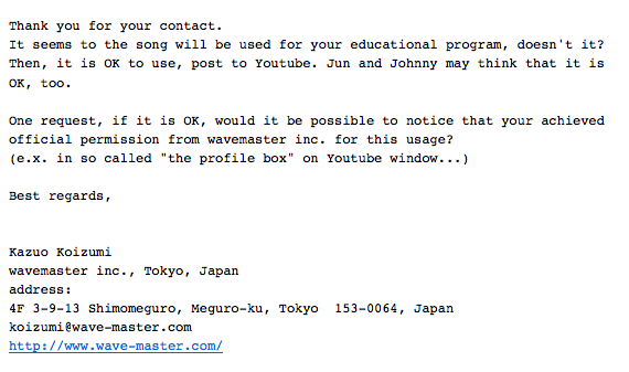
After speaking with Jun Senoue (Crush 40 guitarist) on Twitter, he directed me to a page on the wavemaster website where I could email for permission (http://www.wave-master.com/inquiry.html). I got this response:


They've gave the thumbs up on the condition that I acknowledge their permission when I post the song, which I am more than happy to do.

I have to say that these are some great people, having taken their time to respond to me even though I've had to write to them in English whilst they're based in Japan.

-HM.

Thursday 6 September 2012

Band name research

I need to decide on a band name for the final piece. This might take a while.

For the sake of of fueling some inspiration (because this time around bad McCartney II references won't be good enough) I'm going to have a look at the names of some rock bands I know of and see if any notable similarities stick out amongst them.

  • Crush 40: Because fanboyism. Crush 40 are fab. Their line-up consists of Jun Senoue and Johnny Gioeli, and their band name originates from Jun's love of the Crush soft drink, and Johnny's original belief that he would be old once he hit 40 years old. "Crush 40" sounds really cool, thus attracting the attention of teenagers/young adults.
  • Poison: Poison is dangerous; poison is scary. Therefore, "Poison" is cool.
  • Guns N' Roses: Guns are threatening, roses are not - this appears as a binary opposition, thus creating a conflict. Again, some would see this as cool (especially those of the teenage/young adult demographic).
  • Extreme: This is obviously going out of its way to be cool. TO THE EXTREME!
  • The Darkness: Based around the theme of something that is dark; and people tend to feel more threatened in the darkness. As with GnR, we can see this as being appealing to the previously mentioned demographic.
So, basically, it needs to sound cool. I now need to think of some names fitting the critera of "cool, somewhat threatening". Once I think of some examples of this, I will have to put them on Polldaddy and see what my potential audience thinks is the best. For the sake of realism it wouldn't be a good idea to open for suggestions, due to potential legal issues over ownership of the name.

-HM.

Tuesday 7 August 2012

Pac-Man Fever Animatic Update II

So... another update is definitely necessary, because this is taking a lot longer than it should.

I've drew some new stocks for use in the video itself; these include both performance and running poses for the band members. These will be necessary to fulfil the different sequences I mentioned here.


Yes, I have had to recycle the drummer's art from the Great Escape video; this is because a) it took me a REALLY long time to cut the white out from that drum kit stock last time, and I can't be facing that all over again, and b) the bass drum skin here has the band logo, which going by the star image theory would be built up as an iconic part of the band's image. The size relativity here is a bit off between the guitar and bass, but that can be fixed with some creative placement in the final thing. 

The walking poses are really awkward because of my drawing - the guitarist looks particularly feminine, and bassman looks like he's on a tightrope. The drummer will be running around with his drumsticks; this is purely for humorous effect.

On top of this, we have four guest stars in the video!

(Character designs property of Namco/Midway)

These guys are going to star in the gameplay sections of the video, chasing and attempting to block the band members. 

Now I need to see if this LibreOffice software is as easy(?) to do this with as PowerPoint was for the TGS video; if not I'm going to be stuck using this TouchSmart which has a thing about BSODing at really inconvenient times, which would make this take even longer than it would otherwise. Also, I'm going to be having to use iMovie because I don't have FCP here. Fun times.

I'll see how will be best to go about creating the crowd of COTD's for the crowd shots when I get around to it.

-HM. 

Wednesday 25 July 2012

Pac-Man Fever Animatic Update

Production of this has been particularly slow because of illness; but here's an update to show the general idea of what I plan to do -

I listened to the song a few times and made some rough notes as to what will be on-screen during each part -


I do plan on starting drawing soon; though because of this really annoying cold it may be a while before I feel properly motivated - and I wouldn't want to just throw out something mediocre. My apologies for this.

-HM.

Friday 20 July 2012

"Sheena Is A T-shirt Salesman" Recreation Analysis

After many, many unsuccessful attempts at adding in the frame-stutter effects from the official video I've decided to give it a miss and stick with the regular full-speed video I posted previously.

For the sake of comparing the recreation to the official video, I've been able to use the fantastically useful Picture-in-Picture setting in iMovie to overlay the official video over the top of our recreation.


We can use this to look at what does and doesn't work in the recreation. Am going to start off with the obvious stuff -

- Location: we used the most conveniently accessible room in the school for filming this kind of thing (one of the music rooms, with thanks to the music department for letting us do this!) - it just happens that this room doesn't look much like the one in the official video, with blue walls rather than beige, a different window arrangement and carpet instead of the wooden floor. It's also significantly smaller, which impacts the next point.

- Cinematography: The video is just one take so I didn't have to worry about getting multiple angles of the action, however the room being smaller meant that a bit of creativity was needed in regards to camera position to make sure everyone was in the shot - meaning our recreation shows the action from a slightly different angle than the original.

- Direction: Also impacted by the size of the room - in the original clip they had significantly more space to move around in than we did. This is especially apparent in the parts throughout where a band member walks between the drum kit and the point at the front where the current attention focus is standing - due to the lack of space available this was impossible in our version, meaning they had to play along the back of the room somewhere at these points. Lip-syncing was pretty spot-on - Mr S. has the lyrics to the entire FotL discography permanently engraved in his brain somewhere, and we ran through the most distinct parts of Mr E. and Ms M. briefly before filming. Mr N. appears to have put his own distinct touch into the drumming, which was very much appreciated (though spinning around that much for the duration of the five takes can't have been healthy...). The band's movements in the original original clip look improvised, so I don't think it's a big deal that ours stray from it here and there.

- Costume: We filmed this after a school day and were all still wearing what we'd been wearing in school time. In the original video the band were dressed casually, so ours is noticeably different. The biggest difference is the fact that me and Sarah are clearly not dressed in blue full-body jumpsuits when we run in with the signs - said costume was not available, and not being able to see would have impacted on our ability to follow what was happening on the laptop. We thought that in a one-or-the-other situation, the general direction is more important than the mise-en-scene in regards to staying faithful to the original clip.

...and now for the other stuff -

- Editing: I tried to recreate the frame skip, I really did. I tried multiple different techniques of doing this - out of those I remember, the Strobe (if I recall correctly) filter in FCP was too consistent with frame drops to be faithful to the original (which had them all over the place), cutting around the strobe track to reveal the raw track in parts only worked in theory as it is way too fiddly to get right (and it sticks out like a sore thumb when not right), and laying stills over the individual part looked way too time consuming to justify the effort. The speed looks about right though; this was achieved by filming at half-speed, then adjusting to 200% in FCP.

- Props: We are using different instruments to what the band are using in the original - this is because we didn't have exact copies available, and instruments are expensive. All of the ones we used do, however, serve the same purpose thus making our video just as believable as the original. The only major differences I see are that Ms M. was using Mr S.'s awesome 5-string which I am totally not jealous of in any way *sigh* which is visually quite different to the P-bass(?) Julia is using in the original, and that the Pearl logo is visible on the drum kit in ours. Also, as mentioned previously, the signs in the video were hand-written by myself, because I'm too cheap to get proper recreations printed professionally.

-HM.

Sunday 15 July 2012

Rock Video Analysis 2 - I Want It All

Continuing on from a previous post where I looked at Hardline's Takin' Me Down... here's the video for my favourite Queen song (tied with '39 and Stone Cold Crazy, but they don't have videos...)


So, let's look at how this video relates to Goodwin's music video theory then! In regards to screenshots, these do have a VEVO logo over them. Last time this was the case I was able to Photoshop them out; however this time there are significantly more affected, and my computer which has PS on it takes decades to load up. These will have to suffice.

1) Relationship between lyrics and visuals

As with the Takin' Me Down video, this is purely performance, so that fact tied with the rather vague meaning of the song makes it difficult to pick out examples of this. That being said, however, the "I want it all" lines in the chorus could be interpreted as a desire for a supreme status in one way or another; and at these moments we see a lot of cases where the camera is placed below the band (low angle shot) members, which could represent them being 'high up' -


2) Relationship between music and visuals

As I mentioned before, it's a performance video. This gives us the link between what we see and hear in that we can see the band miming the song on their instruments. There are a couple of things especially worth noting in this video - first is during the a cappella intro we see nothing but close side-on shots of the band member's faces as they are lip-syncing -


This is drawing all of the attention to the vocal harmonies, thus satisfying the relationship between the music and the visuals. Also, as with the Hardline video, we get lots of shots of Brain as he's playing his solo, thus emphasising the solo in the music.


3) Genre characteristics

The Hardline video was performance heavy. This video is performance heavy. Pretty much every rock video I've seen before has been performance heavy. I think it's fair to say one of the conventions of rock videos is that they are performance heavy.

As we can see above, a lot of focus is given to the guitar, though we're also seeing some attention given to the other rock instruments used (the bass and drums) - though nowhere near as much.


4) Close-ups/artist motifs

As seen earlier there are a lot of close-up shots of the band members, to help make their image more prominent throughout the video. It seems most of the attention in regards to image is given to Freddie and Brian - which is highlighted heavily in the vocal exchange part way into the song by showing nothing but close-ups of their faces during their lines -


No, that isn't bad cropping on my part, it's actually shown at a different resolution in the video. Possibly used as a deliberate effect to draw more attention towards them by leaving less white space at the side of the shot.

Brian is shown with the two things we automatically associate with Brian May - his Red Special and his awesome hair (Barthes' Mythologies, anyone?).

There's one point I specifically need to make in regards to the presentation of the artist - and that's that Freddie was really showing signs of his illness by this point - and it's clear that they've gone out of their way to try and hide this - particularly in the way they've employed really harsh halogen lighting to hide how pale his face was at the time. This also seems to be why a lot of the close-up shots of Freddie are shown in greyscale (which would be a recurring theme in a lot of later Queen videos) -


5) Emphasis on 'looking'/voyeurism

I can see no examples of voyeuristic treatment of females... as there are no women in the video. I'm also not seeing much use of 'looking' to engage the audience, outside of the part with Brian/Freddie during the vocal exchange part (for which I will not repost the images to avoid excessive load times...). Part of me is thinking this is part of Queen's image - they've always been shown as more of a whole, rounded theatrical act as opposed to a typical rock band, so it makes sense for them to be shown as a one-way performance.

6) Intertextual references

Again, I'm not seeing anything... possibly because it's entirely performance. The closest thing I can think of is the a cappella intro being filmed over a plain black background, similar to their own video for Bohemian Rhapsody.


-HM.